The Sorry State of Cybersecurity Imagery
The state of cybersecurity imagery is, in a word, abysmal.
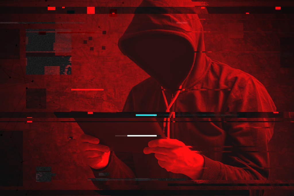


The state of cybersecurity imagery is, in a word, abysmal. A simple Google Image search for the term proves the point: It’s all white men in hoodies hovering menacingly over keyboards, green “Matrix”-style 1s and 0s, glowing locks and server racks, or some random combination of those elements—sometimes the hoodie-clad men even wear burglar masks. Each of these images fails to convey anything about either the importance or the complexity of the topic—or the huge stakes for governments, industry and ordinary people alike inherent in topics like encryption, surveillance and cyber conflict.
This challenge was brought home for us when we went looking for a cover image for a document describing the Hewlett Foundation’s Cyber Initiative grant-making strategy—the foundation’s 10-year, $132 million effort to help develop a cyber policy field that offers thoughtful, multidisciplinary solutions to complex cyber challenges for the benefit of societies around the world. One of us suggested a photo of a crowded subway train, with every passenger engrossed in their phones; the other countered with the image that finally won out—a Shodan map of every internet-connected device. Both images convey the ubiquity of networked devices in our lives, but no image we could find really explained the importance of this issue area nor why the Hewlett Foundation launched its grant-making program. In fact, when we updated our strategy in 2017, we omitted images entirely.
This dearth of quality cyber imagery is a problem because it’s hard to wrap your head around something you can’t visualize. For too many people, the stereotypical hackers and hackneyed “computer” iconography the term “cybersecurity” conjures up are indicative of the blank space where greater understanding needs to be. The lack of visual storytelling language is not that surprising given the immaturity of the cyber policy field and its multidisciplinary nature. That is—the combination of technical, legal, policy, business and other dimensions of cybersecurity—makes a nuanced and sophisticated conversation difficult, whether communicating with words or pictures.
Hewlett is not alone in noting this problem, of course. So in 2018, we decided to partner with global design company, IDEO, on a report examining what needs to change in the cybersecurity visual landscape. Working with OpenIDEO—IDEO’s open innovation practice—we conducted interviews and focus groups with cybersecurity experts from industry, government and civil society, as well as visual creators—talented individuals working in illustration, graphic design and even light projection—“Reimagining Visuals for Cybersecurity” notes five critical design principles visual creators will need to focus on in developing a more effective, nuanced visual language for the field.
First, humanize the space. Today’s cybersecurity visuals often focus on hardware—think circuit boards and server racks—while leaving out all the people who are involved in or affected by the challenges we face in cybersecurity. There are millions of individual stories behind the headline-grabbing numbers in the latest data breaches, and there are real people working every day to secure our devices and the networks they run on. As David Sanger of the New York Times said in an interview for the report, “We need to get people to understand that these moments that begin with a keyboard end in the physical world.” Cybersecurity matters because it has real consequences for real people.
Second, visual creators should strive for accessibility. As with any field laden with technical complexity, the challenge for visual creators is to design depictions of the issues involved that are broadly accessible without being dumbed down or, worse, made inaccurate. A key hurdle for creators is deciding which elements to include and which to leave on the cutting room floor, but their North Star should always be helping others to understand the concepts involved and to be inspired to learn more.
Third, visuals should raise the alarm without being alarmist. While many existing visuals are laser focused on inspiring fear, uncertainty and doubt, many of the cyber policy experts we spoke to warned of the danger of this approach; policy-making based on sensationalized stories rarely addresses root causes or deeper systemic issues. A new visual language for cybersecurity will need to make the stakes clear but include new elements that point a way forward. For example, what would it mean to convey trust or hope in images of cybersecurity?
Fourth, accuracy builds credibility. Current cyber imagery often doesn’t even try to engage with the technical complexity of the topic. Better depictions of the issues involved will need a deeper level of technical rigor, grounded in how the technologies involved actually work. This may be the biggest challenge of all. As our OpenIDEO colleagues wrote in the report:
There is a tension in this field between making an image relatable to the average person and providing the technical accuracy that satisfies cybersecurity experts. This tension may not be entirely on visual creators to solve. The resolution will depend on a shift in mindset on the part of technical experts to accept visuals that are not as technical as those exhibited in journal articles, but are still accurate enough to engage the public without deeply misinforming them.
The fifth and final design principle identified in the report is the need to make the invisible visible. The core challenge of depicting cybersecurity visually, of course, is that so much of it is not tangible. How should a visual creator depict a signal speeding along a fiber optic cable? What does a data breach actually look like? And where do people come into the picture? Each of these is a challenge in need of solving, and visual creators will have their work cut out for them.
This last design principle hints at one approach that may bear fruit: developing visual metaphors for complex concepts, as in the famous depiction of Freud’s concept of mind as an iceberg with the conscious mind floating atop the submerged ego, superego and id. The viewer is immediately aware of the relation of each of these parts to the others and the whole, and the relative importance of each in Freud’s overall framework.
What would an analogous image explaining the basics of encryption look like? We don’t have the answer to that, yet. That’s why we’re continuing our partnership with IDEO, launching an OpenIDEO Challenge for visual creators to tackle what we think are the areas most in need of a fresh visual language—topics like the “internet of things,” hackers and hacking, trustworthiness in devices and networks, privacy, and cyber conflict. In the first round of the challenge, we’re asking creators to share their concepts for how to tackle these and other issues. A panel of cybersecurity experts will then choose a shortlist of the 25 most promising directions and provide mentorship to our finalists as they work to flesh out their concepts. Their final submissions will then be openly licensed, so that nonprofits, media outlets and anyone else in need of cyber imagery will be able to draw on a visual language that better reflects the reality of cybersecurity—in all of its salience and complexity—and what it means for individuals, corporations and governments around the world. If you know a visual creator whose work you admire, or are one yourself, we’re opening the submission process today. And if you’d just like to follow along with the challenge while it’s open, you can sign up to do so here.
Will it work? We can’t say. In fact, even after the research we conducted, critical questions remain about the best way forward, as we laid out in an afterword to the report with our colleague Monica M. Ruiz. These include the best way to bring designers into a productive conversation with experts; whether visuals will need to adopt a strong point of view in a given debate to be most effective (something we’ve avoided in our Cyber Initiative’s grant-making); and whether visuals developed today remain durable and useful over the long haul, or if the pace of technological change means that anything developed today will quickly be rendered obsolete.
The Cyber Visuals Challenge launching today will help begin to answer those questions. Whatever the answers to them, we’re confident that the visual creators who take part will give us all something to think about and help move the state of cyber imagery beyond the tired hackers-in-hoodies visual clichés that fill stock image libraries today.